Advent Calendar — Seasonal Feature
A festive, date-driven Advent Calendar inside the GjirafaMall mobile app — each day of December, customers tap a wrapped door to tear it open and reveal an exclusive product deal, with a celebratory burst to mark the moment.
The Brief
A 24-day advent calendar feature for the GjirafaMall mobile app. The product designer handed me a wireframe of the structure: 24 cards, one reveal per day, three states (locked, ready, opened). Beyond the wireframe, every design and motion decision was mine to make. It would have been easy to ship this as a grid of tiles with three visual states and call it done. I wanted it to feel like something worth waiting for.
The Calendar
Opening today's card.
Opening a door
The Constraint
The calendar lives inside a shopping app, which sets the brief in both directions. It can't feel like a separate product grafted onto the experience — it has to read as part of GjirafaMall. But it also has to feel different enough from the rest of the app that opening today's card feels like an event, not another tap. Every state had to communicate itself at a single glance. A user opening the app on day 12 should know which card is today's without reading anything. And the reveal moment — the actual opening — had to earn the anticipation that the locked days built up.
The Cards as Objects
I designed each card to look like a wrapped gift — a literal metaphor, slightly playful, that matches what the calendar actually is. Ribbon detail, gift-card proportions, a small visual identity per card that hints at variety without revealing the contents. The metaphor matters because it sets the right interaction expectation. A tile gets tapped. A gift gets opened. The visual treatment is what tells the user, before any animation runs, that something is going to happen when they touch it.
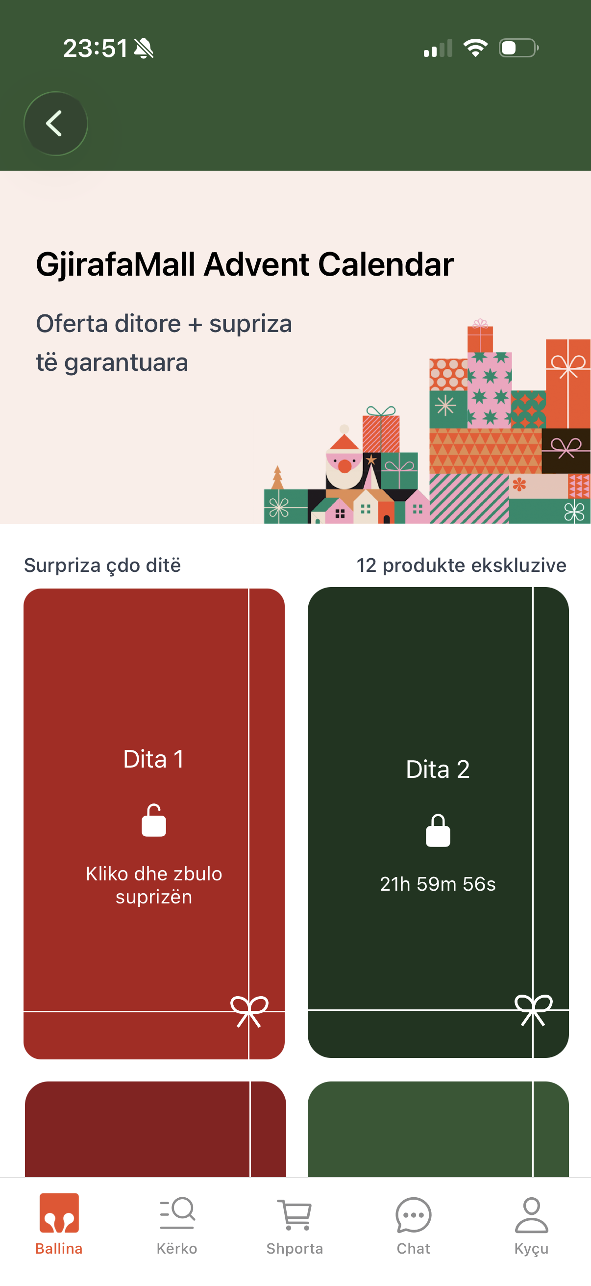
Four States, One Glance
A customer opening the app on day 12 should know exactly where every door stands without reading a word. Locked is a wrapped, Christmas-colored door with a closed padlock, the day number, a bow, and a live countdown to the moment it opens. Available is today's door — still wrapped, with an inviting "Open" prompt and a looping shake that draws the eye to the one door they can open right now. Revealed shows the unwrapped product — image, name, vendor, and a "Best Price" with the original struck through — and taps straight through to the product page. Expired dims the days that were missed and stamps them, so it's obvious the deal has passed.
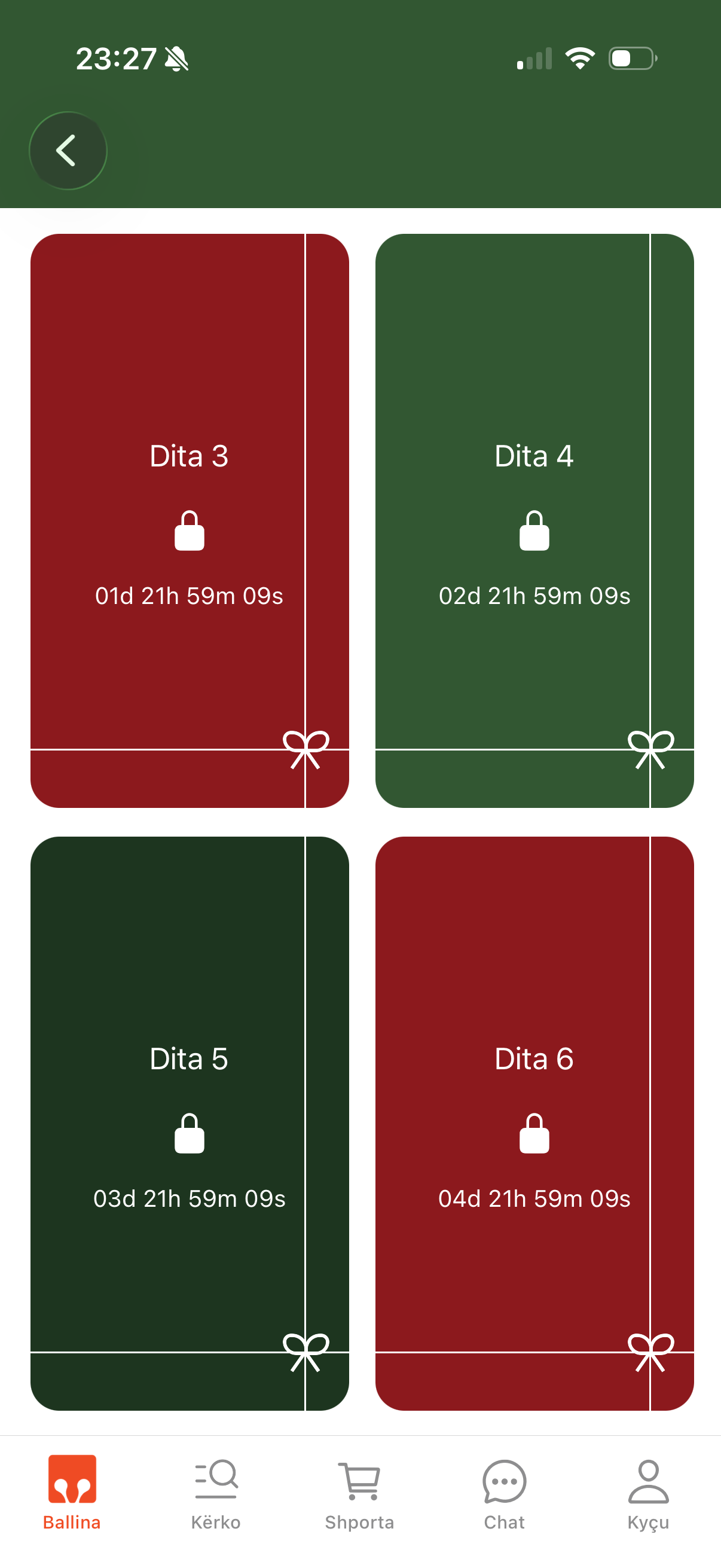
Locked
1 / 4
Date-Driven by Design
Every card knows where it sits in time. A day's state comes from comparing today's date against that day's start-and-end window, combined with stock — so locked, available, and expired all fall out of one source of truth instead of being toggled by hand. And the calendar takes care of itself:
- Remembers what's opened — a revealed door is saved on the device, so returning to the calendar shows the product rather than re-wrapping it.
- Wakes itself up — each locked day's countdown refreshes the calendar the instant it hits zero, flipping a day from locked to openable in real time without a reload.
- Guides to the right door — a floating gift button appears when today's door scrolls out of view and smoothly jumps the customer back to it.
The Reveal
Tapping today's door doesn't flip it — it tears it open. The wrapping breaks apart, the product underneath is exposed, and the screen celebrates. The motion is given room to land, because this is the rare case where the Doherty Threshold is the wrong frame: the customer isn't waiting for the system, the system is making them wait, on purpose, because anticipation is the whole experience.
The Animations
Tapping today's door breaks the wrapping into a 3×3 grid of tiles that scatter outward — each spinning off in a random direction and fading — to expose the product underneath, the way it feels to physically unwrap a gift. The moment it clears, a burst of confetti rains across the screen. Before it's opened, today's door breathes with a soft looping shake that invites the tap, and tapping a day that hasn't arrived yet triggers a quick shimmy — a playful "not yet." All of it runs on native-driven animations for a steady 60fps, even with dozens of cards and a hundred confetti particles in motion.
Idle invitation
1 / 4
Why This Mattered to Me
Most product surfaces are about efficiency. The cart should be honest, the checkout should be short, the search should be fast. The advent calendar is the opposite: it's a surface where slowness is the point. The reveal is supposed to take a beat. The wait between days is supposed to build something. Designing it well meant designing against the instincts that serve the rest of the app — and trusting that anticipation, not speed, was the thing worth optimizing for.
Wireframe → Final
The handoff on the left; what shipped on the right. The bones didn't change — a door a day, one reveal per day. The states, the motion, and the gift metaphor — everything else did.

Handoff wireframe
Shipped
Next project
GjirafaMall App Redesign
An end-to-end redesign of the GjirafaMall mobile app — owned solo from research and Figma through production React Native. A case study in holding design and engineering as one discipline, and the system that came out of it.