Light, quick, and quietly delightful
An end-to-end redesign of the GjirafaMall mobile app — owned solo from research and Figma through production React Native. A case study in holding design and engineering as one discipline, and the system that came out of it.
The Brief
I owned the GjirafaMall app redesign end-to-end, solo — research, UI and interaction design in Figma, and the full React Native and TypeScript build. The hard part wasn't design or engineering on their own; it was holding the two together, where every Figma decision constrained the next code decision and back: a spring drawn on the canvas had to be expressible in Reanimated, a balanced layout had to survive dynamic content and accessibility scaling. What I'm proudest of isn't the screens — it's the system left behind: the component primitives and interaction patterns the team now builds new features on.
Before vs After
Drag the slider to compare the old static experience with the redesigned version. Swipe the phone left or right to compare more pages — same screens, completely different feel.

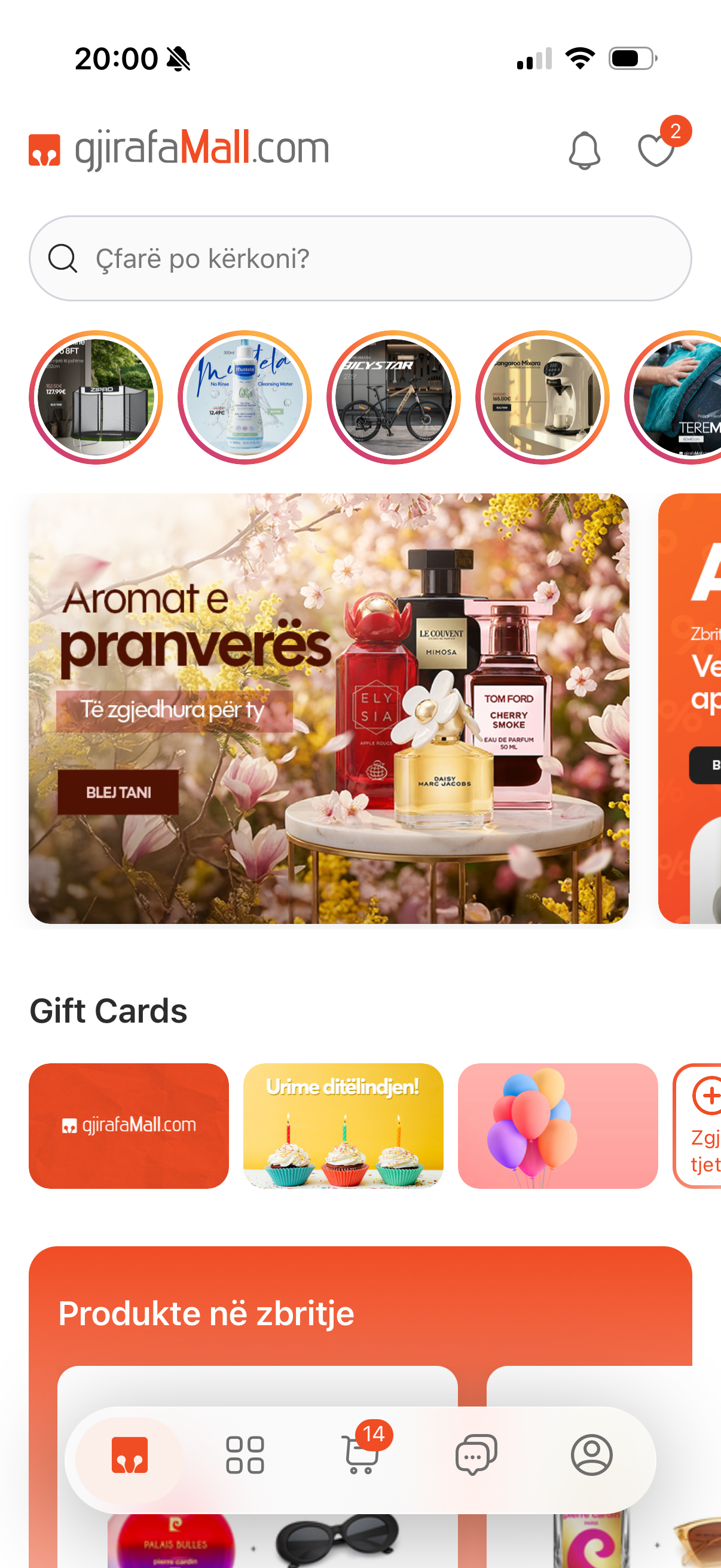
Home
1 / 9
Redesign in Motion
A guided tour through the redesigned app — browsing, product details, add-to-cart, and checkout.
Research — Auditing the Existing App
I treated the existing app as the brief. Walked the full purchase journey on real devices, screen-recorded every flow, and reviewed it frame by frame: where does the eye land, where does the app go silent, which interactions feel mechanical. The output was a ranked list of friction points — that list, not a moodboard, became the design brief.
Design — Refining in Figma
Not a rebrand — a refinement disciplined by the audit. Clearer hierarchy, deliberate whitespace, consistent vertical rhythm. Every transition and micro-interaction was prototyped on the canvas first — timing curves, spring overshoots, gesture handoffs — so implementation became execution, not discovery. If a motion couldn't be expressed cleanly in Reanimated, it didn't make it into the prototype.
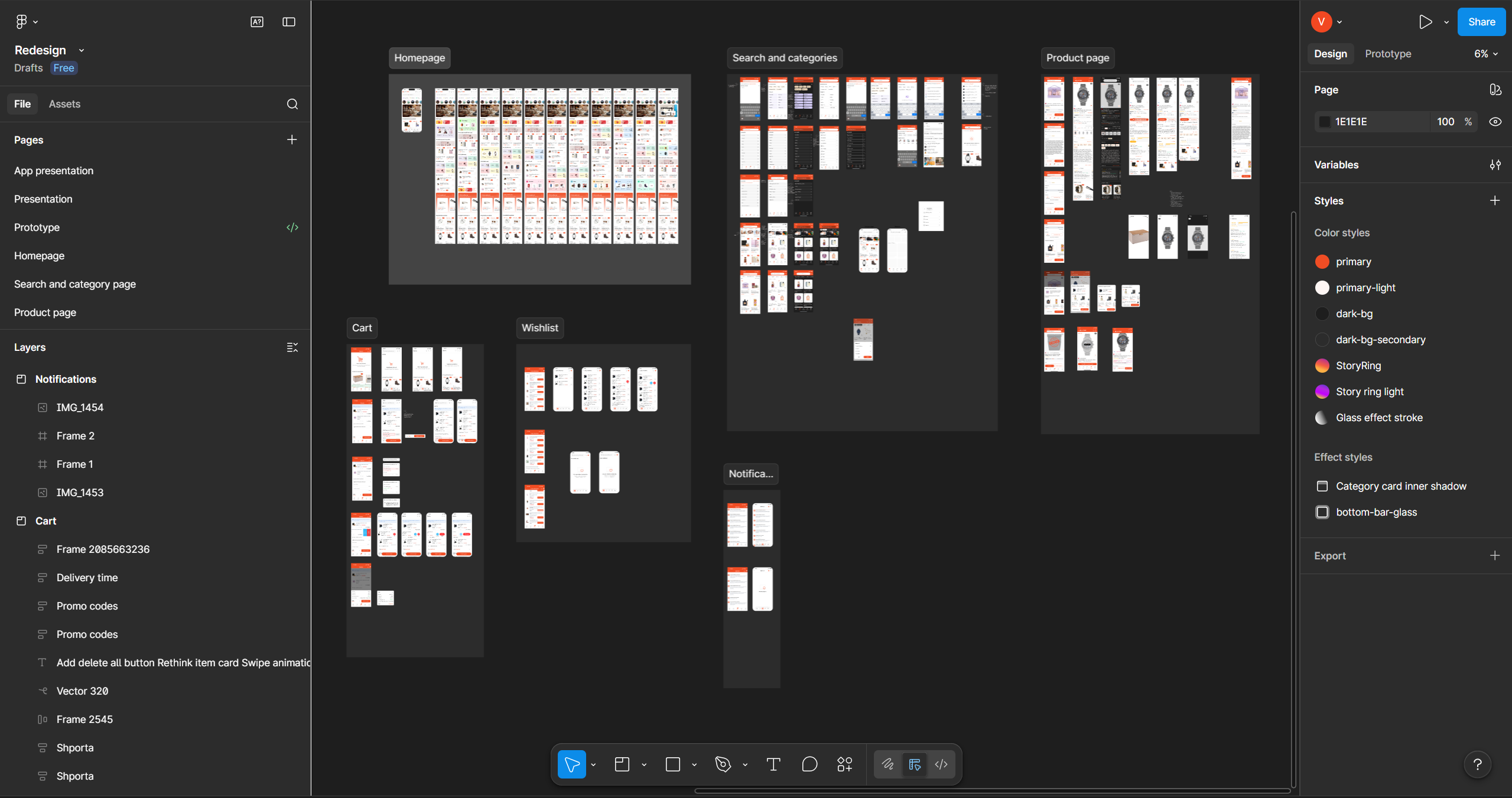
Design canvas
1 / 2
UX — The Laws Behind the Screens
Every layout choice is anchored to a principle. Jakob's Law for the global structure — patterns shoppers already know, so cognitive load goes to the products. Hick's Law caps the tab bar at 5 and hides long-tail filters behind progressive disclosure. Fitts's Law puts primary actions in the thumb zone with generous hit targets. The Doherty Threshold sets the bar for perceived performance — every action gets visible feedback under 400ms. Miller's Law chunks cart, checkout, and order details into scannable clusters. The Peak-End Rule shaped the post-purchase moments, because that's where lasting impressions form.
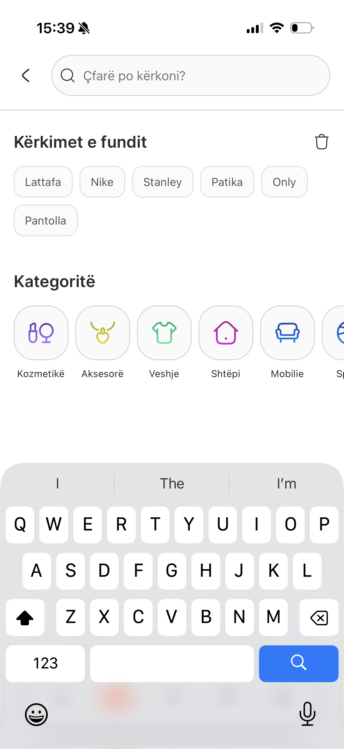
Jakob's Law
Bottom tabs, top-anchored search, product-card grid, sheet-based detail — patterns shoppers already know, so cognitive load goes to the products.
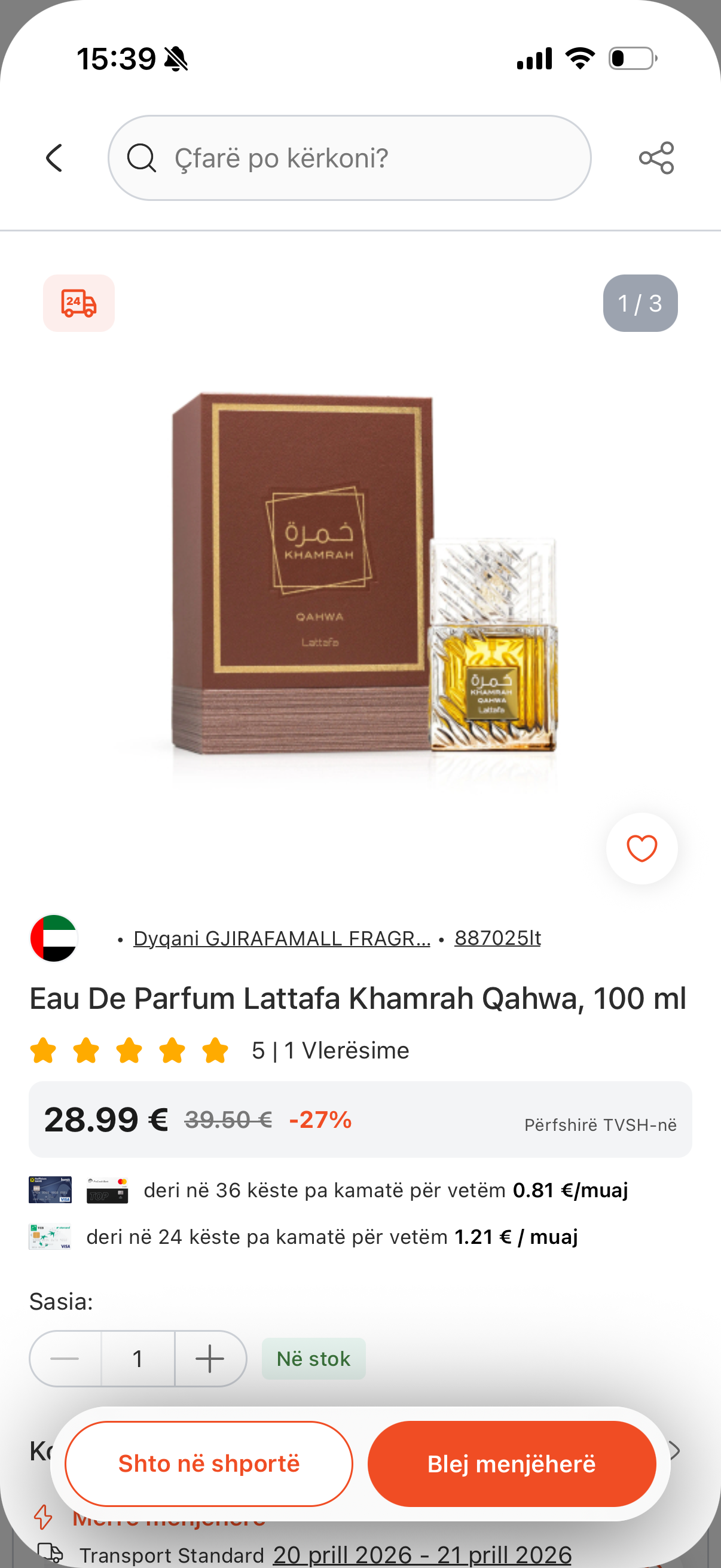
Fitts's Law
Add to Cart, Buy Now, and Checkout sit in the thumb zone with generous hit targets — the most important tap should be the easiest motion.
Doherty Threshold
Every action gets visible feedback under 400ms — optimistic UI, skeleton states, and shared-element transitions exist for this.
UI — Why It Looks the Way It Does
An 8-step modular type scale; weight, not size, does most of the hierarchy work. A 4-point spacing grid — small set (4/8/12) for component padding, larger (16/24/32) for layout — so every gap feels intentional. Color is semantic, not decorative. Cards and inputs share a 12px radius; bottom sheets use 20px so the radius itself signals a different surface class. Subtle elevation, one icon stroke weight throughout. Small choices in isolation — together they're what makes it read as a system instead of a collection of screens.
System — What's Left Behind
Before any feature code, I built the design system as tokens and primitives — spacing, type, color, and composable components (cards, buttons, inputs, sheets, list rows, badges). Each Figma component has a 1:1 React Native counterpart — same name, same props, same variants. The team now composes new features out of these primitives instead of inventing from scratch. That's the legacy — not the screens I shipped, but the ones future engineers ship faster because the foundation is already there.
Micro-interactions That Matter
The details make the difference. Add-to-cart buttons that pulse with confirmation. Tab bars that respond with subtle spring physics. Pull-to-refresh with a branded animation instead of a generic spinner. Image galleries that gesture-zoom with momentum. Each interaction is small on its own, but together they create the feeling that someone cared about every pixel. I used React Native Reanimated for gesture-driven animations that run on the native thread — no JS bridge jank.
Add to cart
1 / 7
Screen Transitions & Loading States
The old app had hard cuts between screens and generic loading spinners. I replaced these with shared element transitions where the product image morphs from the grid into the detail page, skeleton screens that match the actual content layout so the page doesn't jump when data loads, and staggered list animations that make content feel like it's arriving rather than appearing. Every transition was tuned to feel responsive — fast enough to not slow users down, slow enough to be perceived.
Shared element
1 / 3
The Hardest Part — Holding Design and Engineering Together
Solo ownership sounds like freedom, but there's no handoff to hide behind — every Figma decision is a code decision, and every code constraint pulls back on the design. A spring drawn on the canvas had to be expressible in Reanimated. A card balanced with a 3-word title had to survive a 12-word Albanian one. A bottom-sheet height had to coexist with the keyboard, safe area, and dynamic type on real devices. The redesign reads as coherent because the same person made every decision on both sides — and the wall between them was never allowed to exist.
Polish as a Feature
In a competitive e-commerce market, polish is a differentiator. Users may not consciously notice that the cart badge animates when an item is added, or that the checkout button has a subtle gradient shift on press — but they feel it through the Aesthetic-Usability Effect: a more polished surface is perceived as more reliable, even when the underlying functionality is identical. Going beyond the spec with thoughtful visual touches is what separates a good app from one people actually enjoy using. This project let me prove that at scale.
What This Taught Me
- Owning both sides meant I couldn't blame the other — the spec couldn't be wrong and the implementation couldn't fall short, because both were me.
- Design with implementation in mind; code with the design's intent intact. Neither side is allowed to make decisions the other can't honor.
- UX laws aren't decoration — they're load-bearing decisions that have to be defensible to anyone who asks why a button is where it is.
- The most valuable thing a single person can leave behind isn't a polished surface — it's a system that lets the next person ship faster.
- Screens get redesigned. The primitives outlast them.
Next project
GjirafaMall — Mobile App
I was a core contributor to building the GjirafaMall app from the ground up — screens, interactions, and the React Native implementation behind them. The GjirafaMall e-commerce mobile app — built with React Native, serving customers across multiple countries with full shopping, checkout, and account management.