GjirafaMall — Mobile App
I was a core contributor to building the GjirafaMall app from the ground up — screens, interactions, and the React Native implementation behind them. The GjirafaMall e-commerce mobile app — built with React Native, serving customers across multiple countries with full shopping, checkout, and account management.
The Brief
I was a core contributor to building the GjirafaMall app from the ground up — screens, interactions, and the React Native implementation behind them. GjirafaMall is a multi-country e-commerce platform: different currencies, different languages, different delivery and payment landscapes per region, one shared app. I've been a core contributor on the mobile team since joining — building features, maintaining the app through its growth from single-country to multi-country, and treating the live product as a constraint that shapes every decision. My primary work is the purchase experience — cart, checkout, the One-Click flow, and the post-purchase surfaces. It's the part of the app where small friction compounds into abandoned orders, and where the implementation quality matters as much as the design.
The App in Hand
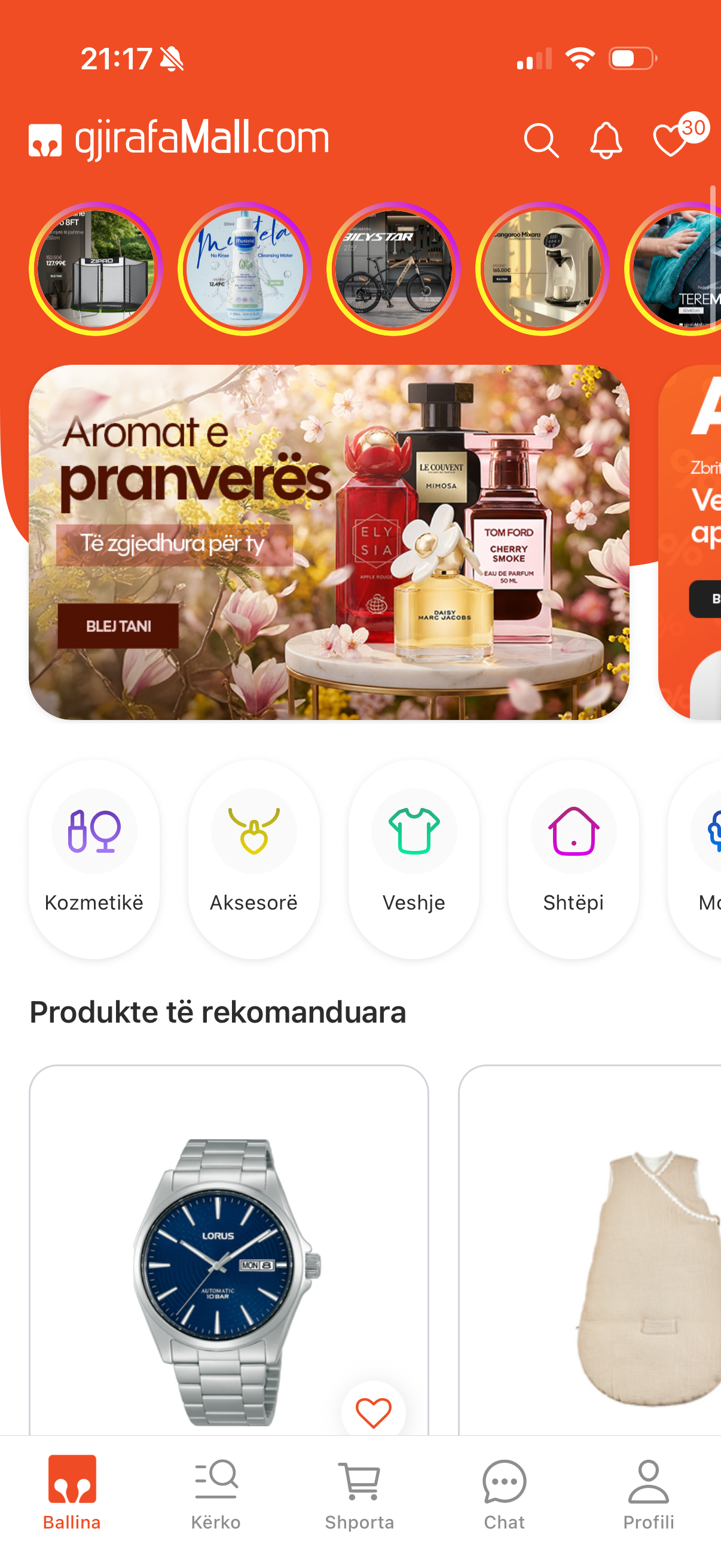
Home
The full shopping experience — home, product details, and cart on iOS and Android
Live in Production
What I Owned
I implemented these flows from designs handed off by the product designer. My job wasn't to draw the screens — it was to build them so they actually felt the way the design intended, and to notice when something didn't translate cleanly from Figma to a real device. That meant raising friction points when I saw them, suggesting micro-adjustments, and refusing to ship anything that looked right on the canvas but felt wrong in the hand.
Reusable Primitives
Before I touched One-Click Buy or Checkout, I built a custom Form library — inputs, selects, validators, error states, the whole kit — so that every form surface in the app could compose against the same primitives instead of re-implementing the same logic five times. Doing this work first paid back immediately: OCB and Checkout were assembled on top of it, and the rest of the team kept reusing it as new flows landed. The same instinct shaped the rest of my contributions — build the shared piece once, make it good, let everyone else compose against it.
- Form library — fields, validation, error states; the substrate the entire purchase flow is built on, and the reason OCB and Checkout could ship as fast as they did.
- CustomSlider — a reusable slider primitive; every slider you see in the app is an instance of it.
Product Page
I authored the first version of the product page end-to-end — the layout, the image gallery, and the buying actions that anchor every product in the app. It set the structure later contributors built on as the page grew, from variant selection to pricing and the entry points into the cart and One-Click Buy. Getting that foundation right mattered, because this is the screen shoppers spend the most time on — the bridge between browsing and buying.
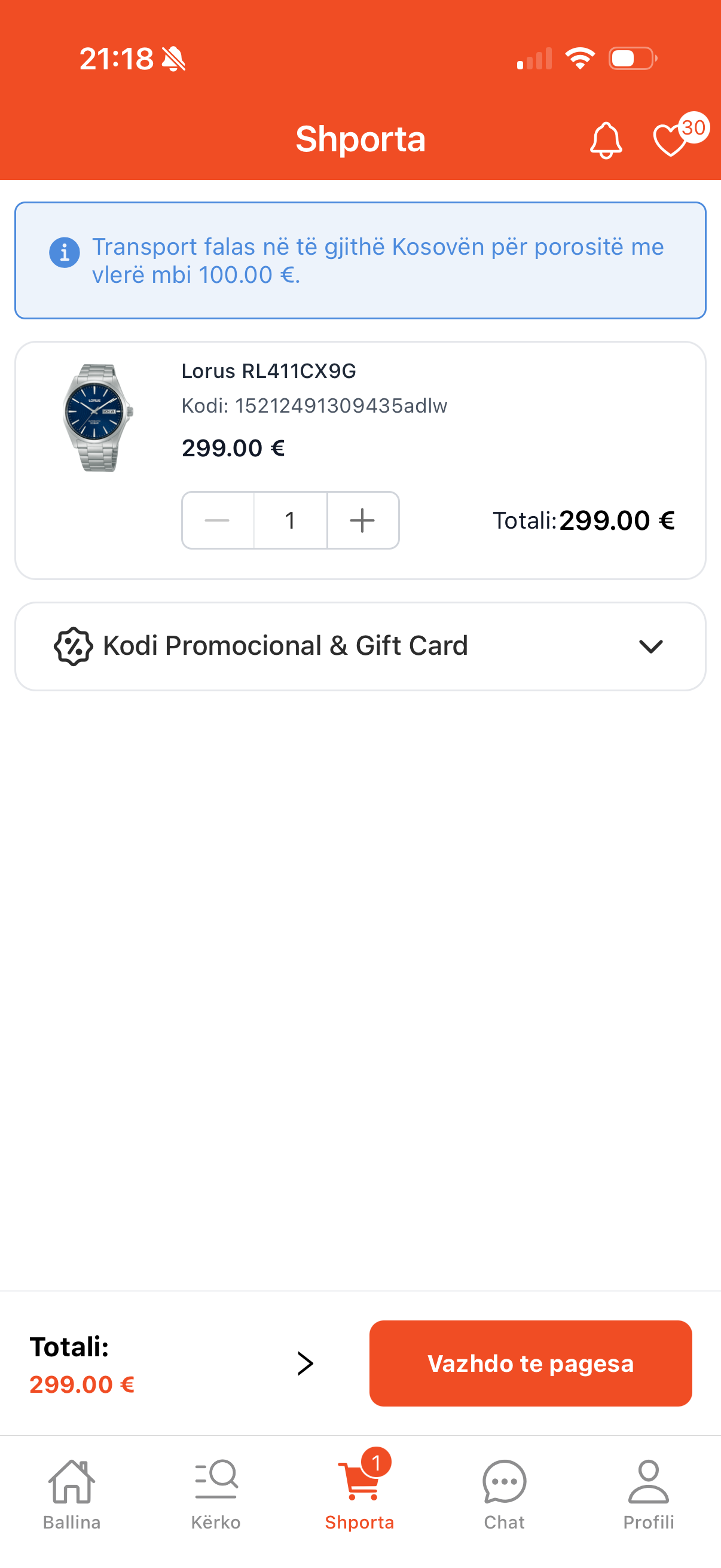
The Cart
The cart is where buying intent turns into a decision, so I built it to feel trustworthy and effortless. It stays in sync with the server so what you see is always what you'll pay, and actions like changing a quantity respond instantly instead of making you wait. It handles everything people actually put in a cart — product variants, gift cards, and discounts — and lays the pricing out clearly so there are no surprises at checkout. It also looks ahead for you: items that are out of stock or slower to arrive are flagged early, so problems surface in the cart rather than after you've tried to pay.
One-Click Buy
For a returning user who already knows what they want, the full cart-and-checkout journey is overhead. The One-Click flow opens as a modal directly from the product page — no navigation, no tab switches, no state to manage in the background. I built it to honor a simple rule the design implied: the smallest possible number of taps between I want this and it's ordered. Returning users see saved preferences pre-filled. New users get a lightweight entry path that doesn't punish them for not having an account yet. The modal owns just enough of the screen to feel decisive without feeling like a takeover.
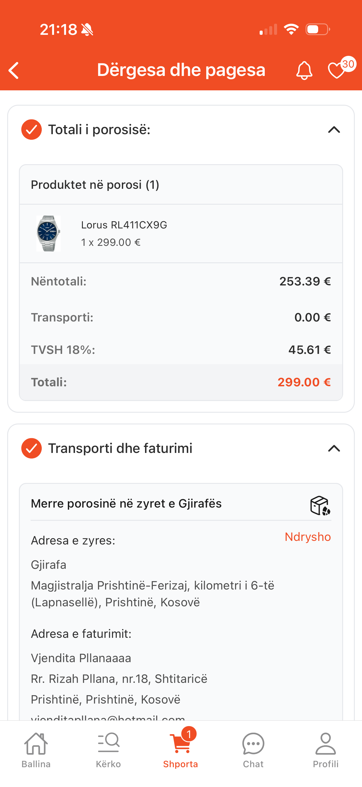
Checkout
I built the full checkout — the last and most important step of the journey. It's reserved for signed-in customers, so saved addresses and cards are ready to reuse, and the flow guides them through delivery, payment, and confirmation one clear step at a time. It handles what real orders need — home delivery or in-store pickup, a range of payment options, and both personal and company orders — while a live summary keeps the total clear so there are no surprises. And it's built to reassure: it checks everything before placing the order, flags anything out of stock, recovers gracefully when a payment fails, and ends on a confirmation that shows the order and where to go next.
Payment Integrations
Checkout is only as good as the payment methods behind it. I integrated the app's payment flows end-to-end — including OneFor and NLB card-on-file — wiring each provider into the same checkout sequence so the user never feels the seams between them. The app supports a full range of options — cash on delivery, online card payments through the major regional banks, in-store terminal, bank transfer, and installments — across Kosovo, Albania, and North Macedonia. Card-on-file meant securely persisting a returning customer's payment preference and surfacing it as a one-tap default, while keeping the entry path clean for first-time payers. My focus was the experience around it — clear success and failure screens, payment locked until an address is set, and a gentle nudge toward online payment.
Post-Purchase
The success and failure screens are the final moment of the journey — where the customer learns whether the order went through. I built both, sharing one cohesive, reassuring design. Success greets the customer by name and confirms the essentials — order number, estimated delivery, and where the confirmation email is headed — alongside a note that they'll be contacted by phone and email, clear next steps to track the order or keep shopping, a built-in FAQ for common questions like cancelling or changing an address, and context-aware extras such as a free eSIM gift or nearby pickup that animate in only when relevant. Failure stays just as honest: a plain notice without alarm, the order number kept for reference but the delivery date dropped since nothing completed, and the same recovery buttons and FAQ so help is right where it's needed.

Success
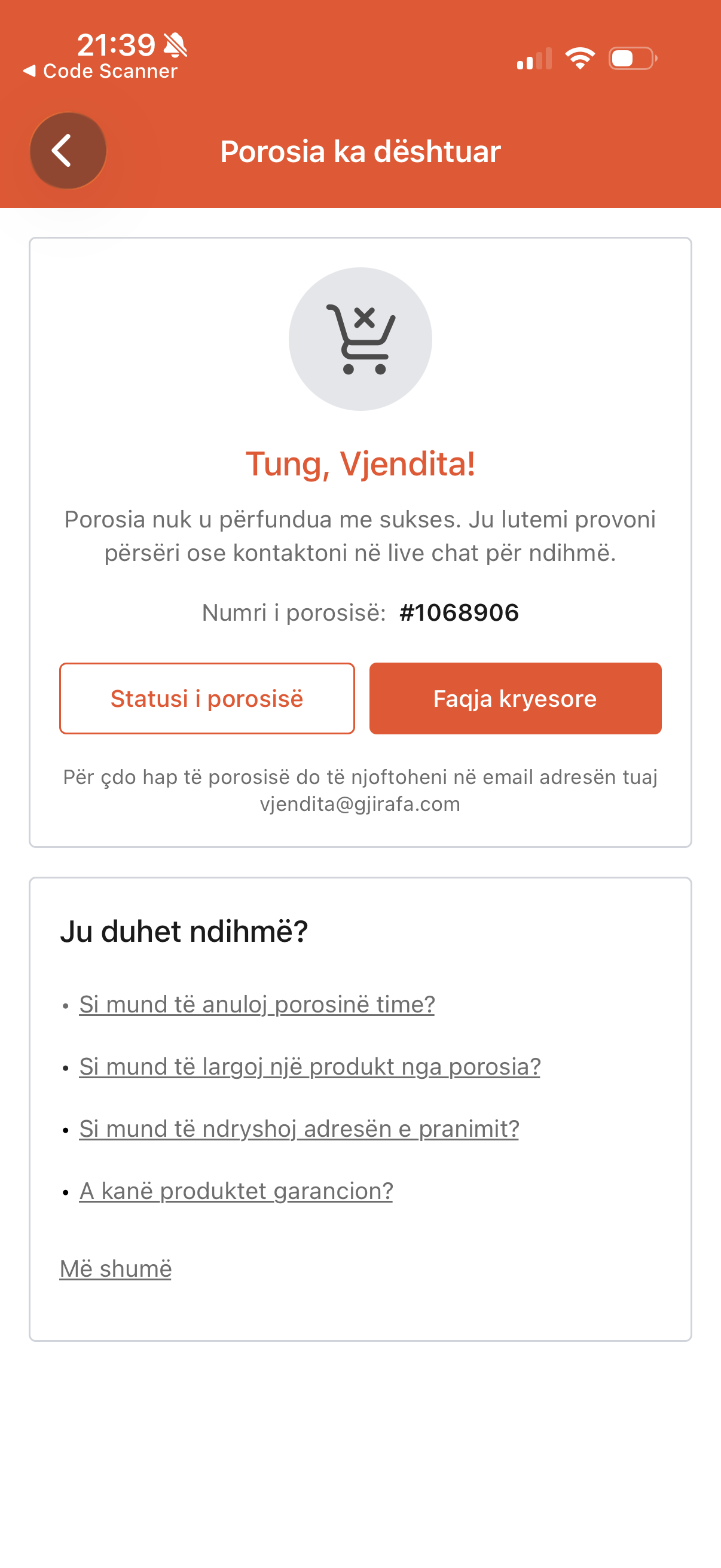
Failure

Live Customer Support — Freshchat
I integrated Freshchat into the app so customers could reach support without leaving the purchase flow. The integration sits behind a contact entry point on order screens and account settings, opens in-app rather than punting to a browser, and carries the user's identity and recent order context into the conversation so agents don't start from zero. The harder part wasn't the SDK wiring — it was making sure the chat surface respected the app's navigation, keyboard, and safe-area conventions so it felt native rather than embedded.
Adapting to Multi-Country
The purchase flow was originally built for a single market. When the product expanded internationally, I contributed to the frontend adaptation: currencies, localized pricing in the UI, region-specific delivery and payment options surfaced through the existing flow. The challenge wasn't swapping values — it was making sure every branch, every validation, and every fallback behaved correctly across regions without forking the codebase.
What I Left Behind
The features I built will keep changing, but the pieces underneath them are the part I'm proudest of. The Form library and CustomSlider weren't one-off solutions — they became shared building blocks the rest of the team composes new flows on top of, the same way I assembled One-Click Buy and Checkout on them. Contributing reusable foundations instead of just finished screens is how one engineer's work compounds across an app this size: the next feature ships faster because the substrate is already there and already trusted.
What This Taught Me
This is the project that made me a mobile engineer rather than a web developer using React Native — the gesture expectations, the navigation patterns, the user on a bus with three bars of signal. The app serves real customers every day, which shapes how you work: bug reports come from actual users with actual carts, and the right call is often the boring one. The value of implementation craft is hardest to see when it works — it shows up as the absence of friction. And the most useful thing an engineer can do inside someone else's design is to refuse to let it ship until it actually feels the way it was supposed to.
Next project
Advent Calendar — Seasonal Feature
A festive, date-driven Advent Calendar inside the GjirafaMall mobile app — each day of December, customers tap a wrapped door to tear it open and reveal an exclusive product deal, with a celebratory burst to mark the moment.